
“Color makes the world go round.” a famous quote from Sydney-based illustrator Christopher Nielsen perfectly encapsulates how essential color is to our daily lives. Think about the brands we love and the advertisements that catch our eye color plays a crucial role in these experiences. One name that stands as a beacon of color consistency and creativity is Pantone. Known globally for defining and standardizing colors, Pantone helps over 10 million designers and producers bring their ideas to life with precision.
In this blog, we dive into Pantone’s remarkable journey, exploring how it transformed from a simple printing company to the master of color standardization.
The Origins of Panton
Pantone’s story begins with a small printing company, M&J Levine Advertising, founded in the 1950s by brothers Mervin and Jesse Levine. Enter Lawrence Herbert, a young chemistry graduate with a passion for colors. Herbert identified a critical issue: the same color appeared different when printed across various mediums. This discrepancy led to significant confusion, especially for large brands like Kodak, where different shades of yellow gave a feeling of old versus new packaging—though the color was supposed to be the same.
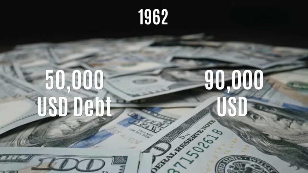
By 1962, with the company in debt, Herbert bought its tech assets for $90,000 and renamed it Pantone. His vision was clear ensure color consistency across different platforms. This dream materialized in 1963 when he introduced the Pantone Matching System (PMS), a revolutionary approach to color standardization.
The Pantone Matching System (PMS)
The Pantone Matching System was more than just a tool; it was a breakthrough. It allowed designers, manufacturers, and creatives to replicate colors precisely across multiple mediums, ensuring that the shade you see on a billboard would be the same as the one on a product’s packaging.
From then on, Pantone expanded its color palette, extending its “library of colors” to 747 colors. The system gained momentum, and in the 1980s, Pantone licensed its proprietary software to major companies such as Adobe, Hewlett-Packard, Microsoft, and Canon, further solidifying its role as the global authority in color.
The Birth of the Pantone Color Institute
In 1986, Pantone established the Pantone Color Institute, a dedicated platform for helping designers and brands leverage the power of color. With the rising demand for more creative control over color, Pantone increased its offerings with metallics, pastels, and a process color system that introduced over 3,000 colors by 1987.
But Pantone didn’t stop there. In 1999, they launched the first-ever “Color of the Year,” further pushing the boundaries of how we view and interpret color.
How Pantone Shapes the World of Color
Pantone’s influence extends far beyond graphic design. Today, their color language supports industries as diverse as textiles, beauty, architecture, and even industrial design. Pantone provides over 10,000 color standards to ensure consistency in materials, products, and services worldwide.
Take Coca-Cola, for example. Different regions initially had varying interpretations of the Coca-Cola red, leading to confusion among consumers. Pantone stepped in and standardized the iconic color under the label “PMS 484.” This ensured every Coca-Cola product had the same shade, eliminating discrepancies and confusion.
Elly Cheng on Pantone’s Process
In an interview, Elly Cheng, President of Pantone, explained that Pantone’s system involves checking colors meticulously to ensure they meet the desired standard. Whether it’s fabric, ink, or paint, Pantone uses highly accurate tools, like spectrophotometers, to ensure consistency across all platforms.

How Pantone Built a Business Around Hues
Pantone doesn’t just sell colors they sell the consistency, reliability, and emotion tied to those colors. Half of Pantone’s revenue comes from their physical color guides, which are regularly updated to reflect new colors and trends. These guides are essential for designers, marketers, and businesses, ensuring the color they choose will look the same across all mediums, even years later.
Pantone also offers consulting services and licenses to companies that want to trademark specific colors. One famous example is Universal Studios approaching Pantone to create the exact shade of “Banana Yellow” for their Minion characters in 2015.
Pantone’s Color of the Year
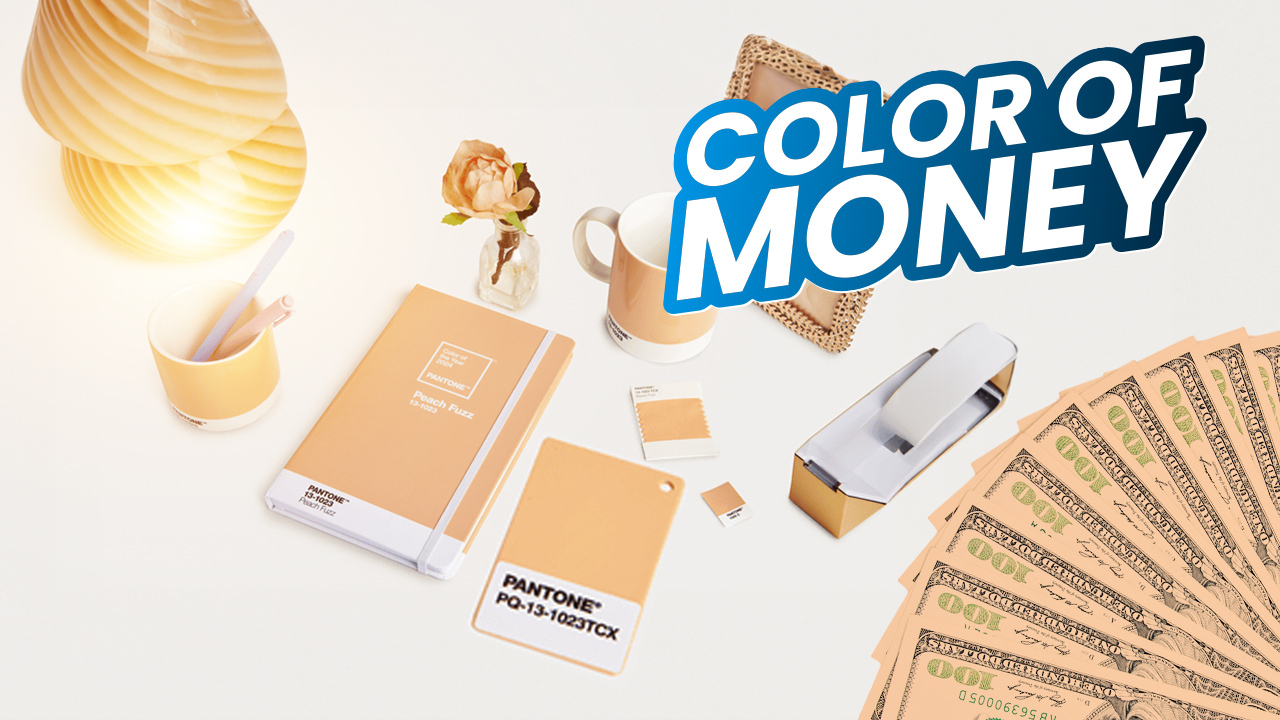
One of Pantone’s most exciting contributions to the world of design is the annual “Color of the Year” announcement. Since 2000, Pantone has selected a color that captures the mood and spirit of the time. In 2024, the chosen color was “Peach Fuzz,” symbolizing themes of nurturing, connection, and rejuvenation.
Here’s a chronological list of Pantone’s Colors of the Year:
- 2000: Cerulean, 15-4020
- 2001: Fuchsia Rose, PQ-17-2031
- 2002: True Red, 19-1664
- 2003: Aqua Sky, 14-4811
- And so on, leading up to the present day…
Each year, Pantone’s Color of the Year sets trends across industries, from fashion and interior design to marketing campaigns and product launches.
Pantone’s Legacy
Pantone’s journey from a small printing company to a global authority on color is nothing short of extraordinary. Through innovative solutions like the PMS and partnerships with some of the world’s largest corporations, Pantone has changed the way we perceive and use color.
Even after their acquisition by X-Rite in 2007 and later Veralto, Pantone remains true to its core mission: ensuring color consistency and clarity across all industries. Their pioneering spirit continues to shape the future of design, fashion, and technology, one color at a time.
Conclusion
Pantone’s success is a testament to how something as simple as color can have such a profound impact on the world. From the packaging on our favorite products to the ads we see, Pantone ensures that colors remain consistent, vibrant, and true to their purpose. In a world that is constantly changing, Pantone offers a constant—a color palette that connects brands, emotions, and consumers.
So, next time you admire a beautifully designed product, remember the Pantone system working behind the scenes to bring that color to life. Because in the end, there’s always room for more color.


